Post by vuvu •°♡ on Sept 29, 2005 17:16:47 GMT -5
Since Akimi-chan asked me how I made her banner, here's a tutorial for it. It is extremely simple, cos I'm a simple person XD But you should know the basics in Photoshop.
This tutorial will be layer by layer, cos it's simpler that way, me thinks XD
Most of my banners are 300x100.. cosI'm too lazy to make bigger ones they look prettier like that >D
So there you go, set your new canvas to 300x100px
Layer 1:

I cropped a picture of the Detective Boys, because they don't get enough love from this fandom XP
The size is only 200x135, because we want to be able to shift it around and leave some space
Layer 2:

Then select bit from the picture that you like. Press Ctrl+J to duplicate that certain part. Move it around to your liking. Now press Ctrl+U and drag the saturation down to -80 ((or whatever you feel like))
Layer 3:

Select an area in the middle, make sure it's big enough for your text to go in. After selecting, go to Select -> Modify -> Smooth. I set mine to 5 so that we get nice round edges.
- the colour of the box is the same as the colour of the leaves around it..
- you can choose to add a light shadow to this box like I did to get a nifty 3D effect
Layer 4 & 5:
Just the text adding bit... Select a colour that will standout against your background, staying with the colour scheme of the picture.
Remember to play around with the 'Character & Paragraphing Pallette' to get the perfect text arrangement >D
Layer 6:
Because we all love tiny illegible text, let's add that in >D
- Set your font to a size unreadble to anyone else, and then type in gibberish, cos no one will be able to read it anyway >3
- Remember, spacing for tiny text is best at 100 or above ^^
Layer 7:
Brushes!!!
All mine are from Hybrid Genesis, from the 100x100 brushes area. I suggest you download them all, because they rule! XD
Layer 8:
Now to the fun part >D
I got this texture from
Hybrid Genesis. Crop, resize it a bit, remembering to feather the selection so that it doesn't look weird later on. Put it onto the text bit... because we want to make it look interesting... or something like that XD
Set it on Overlay.
Layer 9

Another texture from Hybrid Genesis set on Softlight, 100%
Layer 10
Duplicate this layer, set to Overlay. Crop or erase the bits where it is too dark and overwhelming.
-- I ended up dragging layer 9&10 between layer 2 & layer 3.
Layer 11

Now it looks waaaaay too orangey, the way to cure that is gradient in an opposing colour!
I picked a blue gradient ((make your own, this is a dark blue mixed with light blue))
Set it on lighten.
Now you're done, add finishing touches like borders and pattern and final brushing ^^
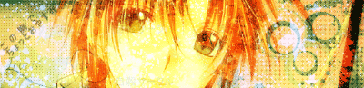
My final result:

---------------------------------------------------------------------------
Yup, I ramble on lots XD
I hope you found this useful ^^ Any questions, feel free to ask :3
And tutorials aren't meant to be copied step-for-step, you may have to use different colours and textures, depending on your pic ^^
I guess you can use this to make siggies too eh...? XD
VuVu
This tutorial will be layer by layer, cos it's simpler that way, me thinks XD
Most of my banners are 300x100.. cos
So there you go, set your new canvas to 300x100px
Layer 1:
I cropped a picture of the Detective Boys, because they don't get enough love from this fandom XP
The size is only 200x135, because we want to be able to shift it around and leave some space
Layer 2:
Then select bit from the picture that you like. Press Ctrl+J to duplicate that certain part. Move it around to your liking. Now press Ctrl+U and drag the saturation down to -80 ((or whatever you feel like))
Layer 3:
Select an area in the middle, make sure it's big enough for your text to go in. After selecting, go to Select -> Modify -> Smooth. I set mine to 5 so that we get nice round edges.
- the colour of the box is the same as the colour of the leaves around it..
- you can choose to add a light shadow to this box like I did to get a nifty 3D effect
Layer 4 & 5:
Just the text adding bit... Select a colour that will standout against your background, staying with the colour scheme of the picture.
Remember to play around with the 'Character & Paragraphing Pallette' to get the perfect text arrangement >D
Layer 6:
Because we all love tiny illegible text, let's add that in >D
- Set your font to a size unreadble to anyone else, and then type in gibberish, cos no one will be able to read it anyway >3
- Remember, spacing for tiny text is best at 100 or above ^^
Layer 7:
Brushes!!!
All mine are from Hybrid Genesis, from the 100x100 brushes area. I suggest you download them all, because they rule! XD
Layer 8:
Now to the fun part >D
I got this texture from
Hybrid Genesis. Crop, resize it a bit, remembering to feather the selection so that it doesn't look weird later on. Put it onto the text bit... because we want to make it look interesting... or something like that XD
Set it on Overlay.
Layer 9
Another texture from Hybrid Genesis set on Softlight, 100%
Layer 10
Duplicate this layer, set to Overlay. Crop or erase the bits where it is too dark and overwhelming.
-- I ended up dragging layer 9&10 between layer 2 & layer 3.
Layer 11
Now it looks waaaaay too orangey, the way to cure that is gradient in an opposing colour!
I picked a blue gradient ((make your own, this is a dark blue mixed with light blue))
Set it on lighten.
Now you're done, add finishing touches like borders and pattern and final brushing ^^
My final result:
---------------------------------------------------------------------------
Yup, I ramble on lots XD
I hope you found this useful ^^ Any questions, feel free to ask :3
And tutorials aren't meant to be copied step-for-step, you may have to use different colours and textures, depending on your pic ^^
I guess you can use this to make siggies too eh...? XD
VuVu


 Oh noes! My dark secrets have leaked out!!! Kidding, now you know how untalented I am ;__; XD