|
|
Post by GhostDetective on Jun 24, 2005 21:20:47 GMT -5
I hope no one will kill me for the ugly banners once they arrive *cowers away* I won't kill you. I'll just be happy if I get an award. And how do you decide who the next judge is?? |
|
|
|
Post by vuvu •°♡ on Jun 24, 2005 21:32:30 GMT -5
Whoever wins most awards this week will be judge next week -- and so on... Though if that person is too busy to be judge, the position will be handed to another winner ^^ -- Just so that we don't keep getting the same winners or judge.
|
|
|
|
Post by GhostDetective on Jun 24, 2005 21:59:45 GMT -5
Whoever wins most awards this week will be judge next week -- and so on... Though if that person is too busy to be judge, the position will be handed to another winner ^^ -- Just so that we don't keep getting the same winners or judge. Okay, thankies! ^^ |
|
|
|
Post by kyubinaruto on Jun 25, 2005 10:22:06 GMT -5
Okay... I hope everybody stops flooding here. I am going to comment on all the submissions last week. I'll post them on multiple posts, hope e mods won't get angry *crosses finger* STRICTLY NO QUOTING UNLESS YOU WANT ME TO EAT YOU ALIVE. IT KILLS MY PHOTOBUCKET BANDWIDTH. I am sorry for bad grammars n stuffs, in a rush to complete hw. If you dun understand anything, do say. [glow=red,2,300]Vuvu[/glow]  Great one! My cousins like it too (Note that they helped in choosing the awards) The only flaw about this pic is the L of struggle has to be clearer.  This one is a bit too green and the font doesn't really suit, I think the font should be rather faded and maybe you can add a ? behind the light cause the light is too dim   This two are good as well although it doesn't really appeal to me as much as your winning one.   *nods nods* Both are Very good although the sakura one you have to fade the red rectangle a little, maybe feathering and erasing it will do?  I like the brush work done but there's not really much effort put in this avatar >< Nonetheless, it's a good one!  ... it's good and everything, but when i look from afar, it looks only like a red square  Can't see syaoran's face clearly >< but yep, it's good. I don't understand the text though   The pic is rather unbalanced. Inuyasha is too bright and stuffs. Colour is dull for the theme 'confession'  Like the effect and stuffs but is not really smth that u wld want to put in ur msn icon? Maybe add a lil bit of text, they help alot in avatars  Yup *nods* good arrangement of pics! Size chosen is good as well  Same as the avatar, too simple. The characters have to be moved slightly to the middle, unbalanced placing of characters. |
|
|
|
Post by kyubinaruto on Jun 25, 2005 10:30:34 GMT -5
[glow=red,2,300]Tantei[/glow]  Yea, it's good and everything but there's something missing in that sig. I think it's rather stiff (?) Colour a bit too dull (?)  I like it, the fonts and everything. This sig is one of the best abstract i've seen in this forum because the scan blends with the background, that's one thing very important when doing a signature. The only thing that's unnecessary i would say is the bevel. Usually for sig, it's rather seldom tt ppl will put a bevel unless it's a border. [glow=red,2,300]Spiritgal[/glow]   Very cute ^^ But do tween it, the change in frames is too sudden.   the border is weird >< the fonts can be improved. Try not to bevel texts in avatars (note: TRY)  The blue box on conan is really irritating. Add some effects and text to enhance this avatar |
|
|
|
Post by kyubinaruto on Jun 25, 2005 10:45:37 GMT -5
[glow=red,2,300]Sherry[/glow] i2.photobucket.com/albums/y49/kyubinaruto/c61ed58a.jpg Nice attempt. The font chosen suits the scan just nice. Being a waller myself, this wall is too simple for me. A few flaws made: 1. The character scan is very blur. you can do this to clean the scan. Duplicate the image. On the duplicate layer choose Filter > Noise > Median. Choose a radius of 5 pixels (depends on quality of pic) and press OK. Change that layer blending mode to overlay/softlight/whatever that is good with the scan. Credit to imanimetions for tutorial. This one is an easy way, but sometimes it's not enough. Trust me, when u get a hang on walling, u'll find better ways to clean a picture. You can do the same way to brighten the sky after you clean the scan. I emphasis this to everybody. 2. The picture is not balanced. The name should at least be at the corner, not overlapping the picture 3. The words 'What's up there?' and he's in the sky, shldn't it be what's in there? 4. My cousin said smth abt conan floating in the sky, but that i can't really say much since the objective is that. 5. Extraction is rather poor, but is much better than people out there (not this forum) will post a better way next time when i clean my own fma pic. [glow=red,2,300]Miyuuko[/glow] i2.photobucket.com/albums/y49/kyubinaruto/5e08de64.jpgThe idea is good! Really like it >< the flaws: 1. extraction is poor, don't leave white lines, it's irritating >< 2. The background is very blur, do the same way i suggested to sherry 3. when the theme is 'broken up inside', the pics chosen should be really sad, and not smiling. 4. The name of the waller should be smaller and put at the corner. This one is really optional, but most people would not like to see the waller's name in the wall and very obvious (won't look good on desktop) This also causes the words 'broken up inside' not very catchy. These words should be positioned somewhere in the middle and more 'grungy' looking. |
|
|
|
Post by kyubinaruto on Jun 25, 2005 10:54:52 GMT -5
[glow=red,2,300]Riweda[/glow]  I like the abstract background but sig doesn't only come with good backgrounds, the scan has to blend in to the background, (your latest ones are good, although still can be improved) The texts have to be improved as well , doesn't really suit with the abstract background [glow=red,2,300]Meitantei Mina[/glow]  The thing i don't like about this pic is the quality of both scans are different (the colours). One thing you can do is that, you should blur the sxs scan on the left and make it the background instead. It's weird to have ALL the same characters on one signature. Improve on the colour of the text but the font chosen is good ^^ [glow=red,2,300]Kawaii tsuki[/glow]  Wanted to give you an award but no time to do that >, sry buddy! It's good and everything but it doesn't really look like a siggy >< Looks more like a banner. The thing you can improve on is (i supposed) the blending of the scan into the background and more brush work on the background ^^ Keep up the good work! [glow=red,2,300]drewkim[/glow]  Yup, it's neat ^^ REally like the text and the colour chosen. The scan of the detective boys can be improved though, it's too dark! |
|
|
|
Post by sherry on Jun 25, 2005 10:55:52 GMT -5
[glow=red,2,300]Sherry[/glow] i2.photobucket.com/albums/y49/kyubinaruto/c61ed58a.jpg Nice attempt. The font chosen suits the scan just nice. Being a waller myself, this wall is too simple for me. A few flaws made: 1. The character scan is very blur. you can do this to clean the scan. Duplicate the image. On the duplicate layer choose Filter > Noise > Median. Choose a radius of 5 pixels (depends on quality of pic) and press OK. Change that layer blending mode to overlay/softlight/whatever that is good with the scan. Credit to imanimetions for tutorial. This one is an easy way, but sometimes it's not enough. Trust me, when u get a hang on walling, u'll find better ways to clean a picture. You can do the same way to brighten the sky after you clean the scan. I emphasis this to everybody. 2. The picture is not balanced. The name should at least be at the corner, not overlapping the picture 3. The words 'What's up there?' and he's in the sky, shldn't it be what's in there? 4. My cousin said smth abt conan floating in the sky, but that i can't really say much since the objective is that. 5. Extraction is rather poor, but is much better than people out there (not this forum) will post a better way next time when i clean my own fma pic. [glow=red,2,300]Miyuuko[/glow] i2.photobucket.com/albums/y49/kyubinaruto/5e08de64.jpgThe idea is good! Really like it >< the flaws: 1. extraction is poor, don't leave white lines, it's irritating >< 2. The background is very blur, do the same way i suggested to sherry 3. when the theme is 'broken up inside', the pics chosen should be really sad, and not smiling. 4. The name of the waller should be smaller and put at the corner. This one is really optional, but most people would not like to see the waller's name in the wall and very obvious (won't look good on desktop) This also causes the words 'broken up inside' not very catchy. These words should be positioned somewhere in the middle and more 'grungy' looking. thanx for the comments!! i'll try better next time! |
|
|
|
Post by kyubinaruto on Jun 25, 2005 11:03:47 GMT -5
[glow=red,2,300].::ka::.[/glow] Seems like you like to work on gradients ><  Like this cute ava, but the colour is a bit too dull, there's one colour that's missing in this pic to make it perfect...  Love the bubbles! and fonts (can u tell me wat font did u use ><)! It's really good!     Yup *nods* perfect avatars but the technique used is not tt original >< (that's y vuvu-chan's got first).  Wee! The scan, fonts and background blends really good together! b^^d Highly entertaining ><  Sadness... but the colour is a warm colour! Get the 'cool' colours  The text is irritating! Maybe u shd get a cursive writing instead. Basically everything else is good ^^  Weird gradient colour >< A bit sudden change in colour [glow=red,2,300]fruitsbsk28[/glow]  Cute >< But it's too simple.  The font is weird. work on the colour of the font ^^ [glow=red,2,300]detective[/glow]   If you want to make these better, clean the scan a lil bit and add colours. It's too simple >< |
|
|
|
Post by kyubinaruto on Jun 25, 2005 11:15:28 GMT -5
[glow=red,2,300]Blackpearl[/glow] Cool! naruto sigs!!!!! Your extractions are good, better than mine!  Too wordy >< The words overlapped sakura and sasuke. Choose a better border colour as well >< But hey! U're improving. This one is much better than the others.  Err... Get lost? and it's in pink? change the text ><, it doesn't fit the scan. Character scan is blur and dull, clean a bit and brighten it.  Get a smiling picture of Sasuke, feather and delete the edges because the sasuke is supposed to be in sakura's 'dream' and fade it into the background. Yup, clean the extraction and wordings can be improved. Just a penny for my thought, since it's daydreaming, i think u shd change e colour of the sky to blue. Tt's an opinion, u dun have to do tt  It's good and everything but that scan of sasuke u've chosen is not very good, it doesn't blend well with the backgroudnd. try to create an abstract background with riweda's tutorials. Bevelling the edges is not really a good idea, make a techy border instead. [glow=red,2,300]Angie[/glow] Good avatars there!      one flaw abt these animated avatars... the last frame shd be tweened with the first frame, it'll look better.  CUTE ^^ but e heart doesn't really fit well with the scan  In all the 3 versions of these siggies, sry to say but the scans chosen is not very gd... After all it's issho no tomodachi. Just a suggestion: You should make both of the girls face each other and if you can, get a smiling pics of them >< extraction can be improved. Oh and another thing, the whole sig is too dull for a 'cheerful' theme.  I dun really like this ver as much as the others...  The butterflies are good, but there are some awkward blank spaces. Some suggestions on what you can add... drop shadow brushes with 0 hardness; stars? |
|
|
|
Post by kyubinaruto on Jun 25, 2005 11:17:58 GMT -5
Thanks for everyone who participated, hopefully my comments are not very harsh and is helpful. I'll post a few good tutorials when i have the time (sch's reopening.. tt sucks) Anyway those suggestions are just what i think that can be improved, i have no idea on what others thought.
But one thing for sure, you guys are improving well b^^d Don't be scared in posting ur graphics, be it ugly or disastrous.
All hate posts shd be directed to me
DIRECT LINK/QUOTE PICTURES AND YOU WILL FACE MY WRATH!
|
|
|
|
Post by GhostDetective on Jun 25, 2005 14:19:43 GMT -5
Aww, you didn't comment any of mine T-T. That's okay, i'm just joking. But are mine any good? I have posted a lot in the siggies 2 thread.
|
|
|
|
Post by Angie on Jun 25, 2005 18:40:26 GMT -5
LOL, I didn't know about tweening backward until yesterday when I did another experiment XP As the Aoko one, the text and heart were originally from the scan...I tried to squeeze them in without losing Aoko's head ^^;; Siggies...eh...Was doing experiments on them and forgot to make the picture quality better. Ah well.
|
|
|
|
Post by vuvu •°♡ on Jun 25, 2005 20:46:04 GMT -5
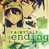
@ ghost: Kyubinaruto is just commenting on the ones that were in her week; I'll be commenting on your one ^^ Wow...! Great job -- that must have taken so much time. And what you say are all perfectly correct!! Thanks for the pointer ^^ Kk, I have been busy this week x.x With evil teachers and friends' birthdays and everything. So I still owe some people's banners ((precisely Angie, Ghost's and Mahotou's)). But check back in this post and you'll find your banner ^^;;; As for the comments, they will arrive later, in your PM inbox to save up the spaces in this thread ((all participants will get comments)) ^^. They should arrive by the end of next week. I am so sorry!! Banners: ((as I said before, this is my first time with them, so sorry for the quality >.< If you don't like yours, tell me, I'll redo it)) Siggie Awards:   Avatar Awards ((not as much submissions in this category :/))   Ok, the judge for next week will be .::ka::. who has confirmed that she will be free enough to make the banners and so on. Good luck to her!!! ^^ |
|
|
|
Post by GhostDetective on Jun 25, 2005 21:29:03 GMT -5
I won an award you say!! ^__^
Thanks! I can't wait for the banner for it though!
|
|